I am beginning to question Rick Dowell's sense of taste. Apparently he finds the absolutely hideous Sheraton colors to be inspirational?? I don't know what else to say.
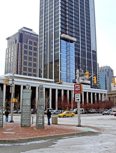
SandRidge's architects like to bulldoze a quarter of downtown but at least their new structures are architecturally acceptable, granted, the Dowell Center is a tough one to remake. The whole thing needs to be recladded, truthfully. It can be done. Look at this Indy skyscraper (One Indiana Place) as an example:

I really don't mean to be piling onto Dowell, who has done excellent work in the past. However, he doesn't understand the value of working with the community (which goes beyond just being stubborn), and this is just plain ugly. He was in cahoots with SR over the sinister demo plan for this??
My third-straight post under the label of "bad projects." But trust me, there ARE good projects out there.


2 comments:
It's funny you post this, I actually find this buildings color scheme to be quite hideous as well. It's actually one of my least favorite buildings downtown because of that. I hate to think they'd not only perpetuate the colors but make them more prominent.
This iss a great post
Post a Comment